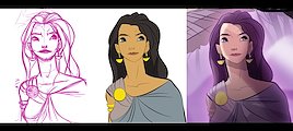
PROCESS | THE GREY-EYED GODDESS ATHENA | Here's a series of images indicating my artistic process. I sketch my characters on paper (I love the look and feel), but then I'll ink and paint digitally, finally compositing my characters in Photoshop.
I inked this image in Illustrator, laying down the first round of color and then added compositing touches and textures in Photoshop. This was a concept piece for an children's book idea.
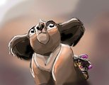
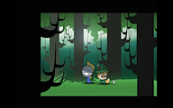
I created this painting as part of an animation project I was developing. I'd decided to try exploring a more painterly look in my artwork, to give it a go. This was, I think, the first piece I tried. I started with a darker color and began painting the sunlight on, in layers, to start bringing in those details.
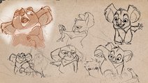
This model sheet was part of a personal project I was developing for animation. I always sketch in pencil, but these sketches were then brought together in Photoshop.
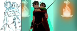
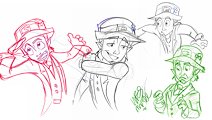
Here's another process shot. You can see, here, that I'd changed the finished piece from the original sketch, adding a faint smile to the man's face and changing his arm position.
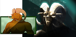
AETOS THE SATYR | Here's another sample of a painterly style. The drawing on the left reflects my usual painting method. The painting on the right brings a more mature look. I think I must have created it to make sure I could still tackle that painterly style.
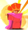
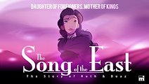
This poster was for an animated pilot I'd developed and pitched. I wanted to bring some gravitas and relatability to a biblical story so that it felt like something that had happened, in time and in our own history.
The drawing on the left was my attempt to capture what I'd seen DreamWorks master Nico Marlet do in his work. While this doesn't capture his method, I enjoyed the monochromatic approach. For the image on the right, I was trying another approach—one in which digital color is dropped into sketchy pencil lines. Both images were explorations.
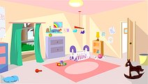
This was my first commercial animation background. I based the camera angle on another animation background I'd seen; we used this for a baby animation project in which the client wanted to feature the crib at the center.
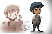
These character sketches explore a character I'd created for a children's poem I'd written and submitted to the Writer's Digest writing competition (awarded honorable mention).
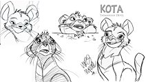
These sketches explore the Tasmanian devil. They're much cuter than the Looney Tunes would have one believe!
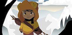
This is an exploration for another children's book idea, based on my oldest nephew (who kept gaining new sisters). I never did much with the project, but I enjoyed the line-less approach to the art.
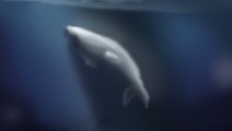
This was another exploration of a painterly image (this may have been the second image I'd attempted in this style). At the time, I was very interested in Australia's albino humpback, Migaloo, who inspired this image.
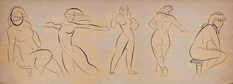
Some of these gesture drawings are based on a model while others were drawn from free hand. I used very minimal line work and enjoyed the impressionistic technique.
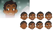
These faces are all animation assets. The different mouth positions are swappable art pieces so that this character rig works in animation. This character went on feature in my first (Regional EMMY®-winning) animated series as director.
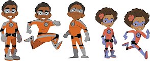
TERRY’S SAFETY SQUAD | Here, final character rigs feature beside finished concept images. My costumer design sister designed the suits.
This image features comic characters I'd published while at University in student papers. The strip was popular among students; some mentioning it was their only reason for grabbing an issue. I went on to develop an animated pilot short.
